A brand identity for Vantage, a Manchester-based business looking to establish a more refined and professional visual presence.
The project focused on creating a clear and confident identity that reflects the business more accurately and supports its positioning.
To celebrate it’s 10 year aniversary, Vantage wanted a rebrand to reflect its evolving status in the market.
Overview
The existing visual presence lacked consistency and did not fully communicate the level of professionalism expected within its sector.
There was a need for a more considered identity that would present the business with greater clarity, while helping it stand out in a competitive environment.
The aim was to create a brand that feels assured and well-structured, without relying on unnecessary detail.
The Challenge
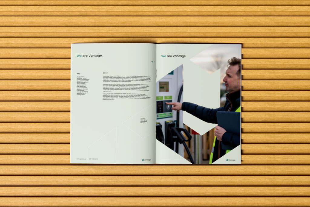
The project began by defining a clear visual direction, focusing on simplicity, balance and restraint.
Rather than adding complexity, the approach centred on refining the essentials such as typography, spacing and layout to create a more controlled and confident outcome.
The intention was to develop an identity that feels deliberate and well resolved, allowing it to work effectively across different applications.
The Approach
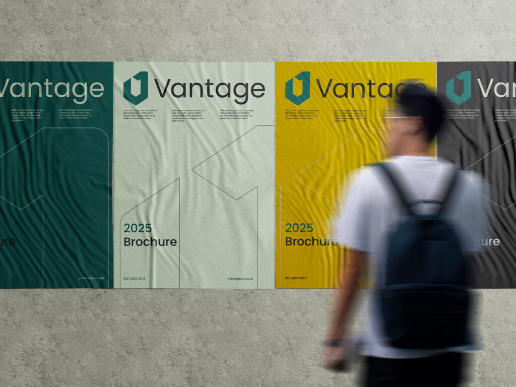
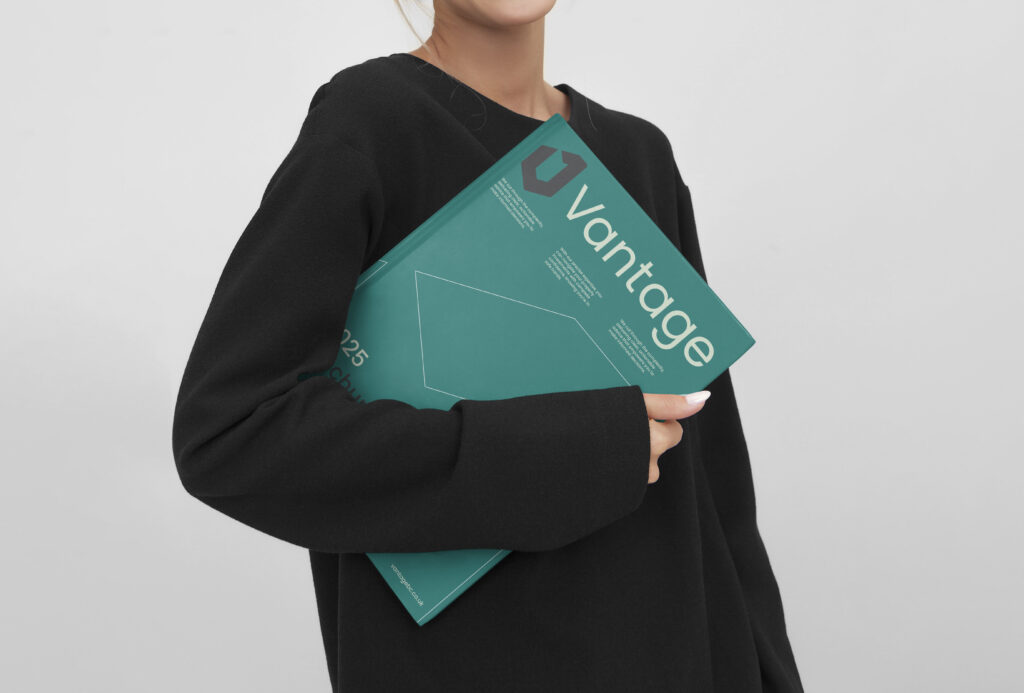
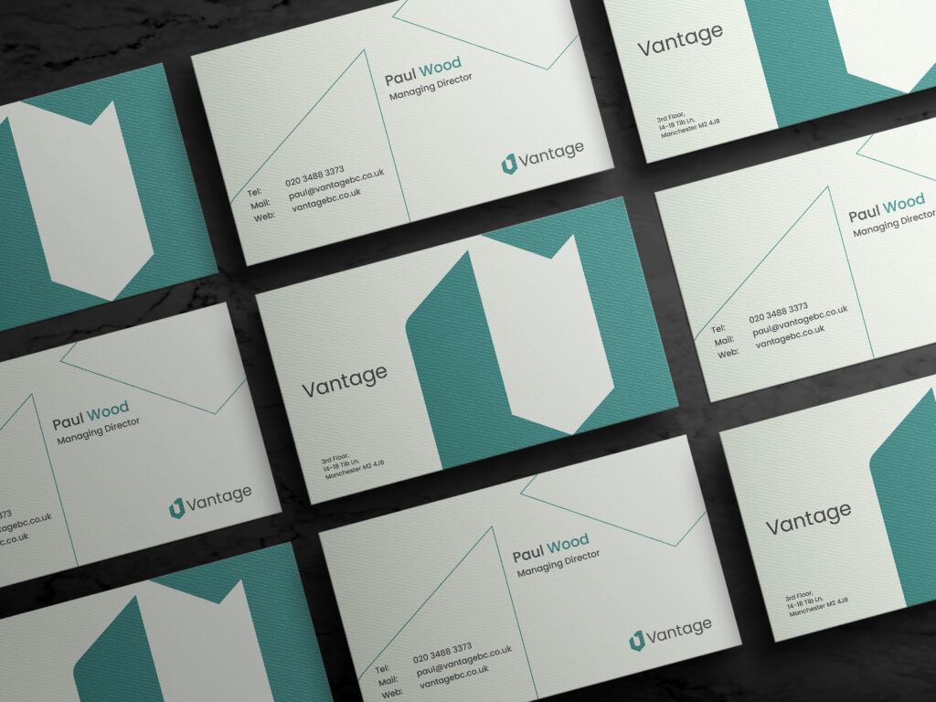
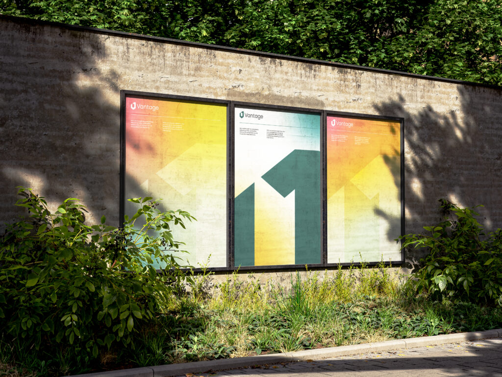
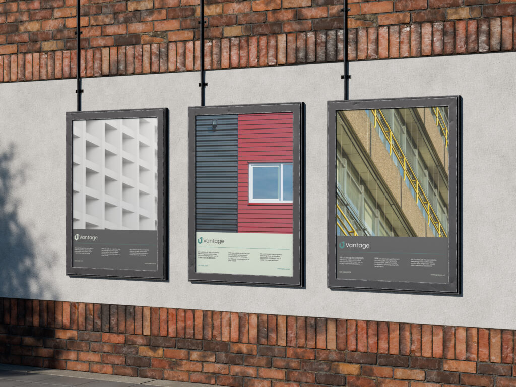
The identity is built around a clean and structured visual language, using a restrained colour palette and carefully selected typography.
Emphasis was placed on alignment, proportion and consistency, creating a brand that feels stable and professional without being overly rigid.
The result is a flexible identity that can be applied across a range of touchpoints while maintaining a strong and cohesive presence.
Brand Identity
Vantage now has a more defined and consistent identity, better reflecting its intended positioning.
The updated brand brings greater clarity and confidence, helping the business present itself in a more professional and considered way.