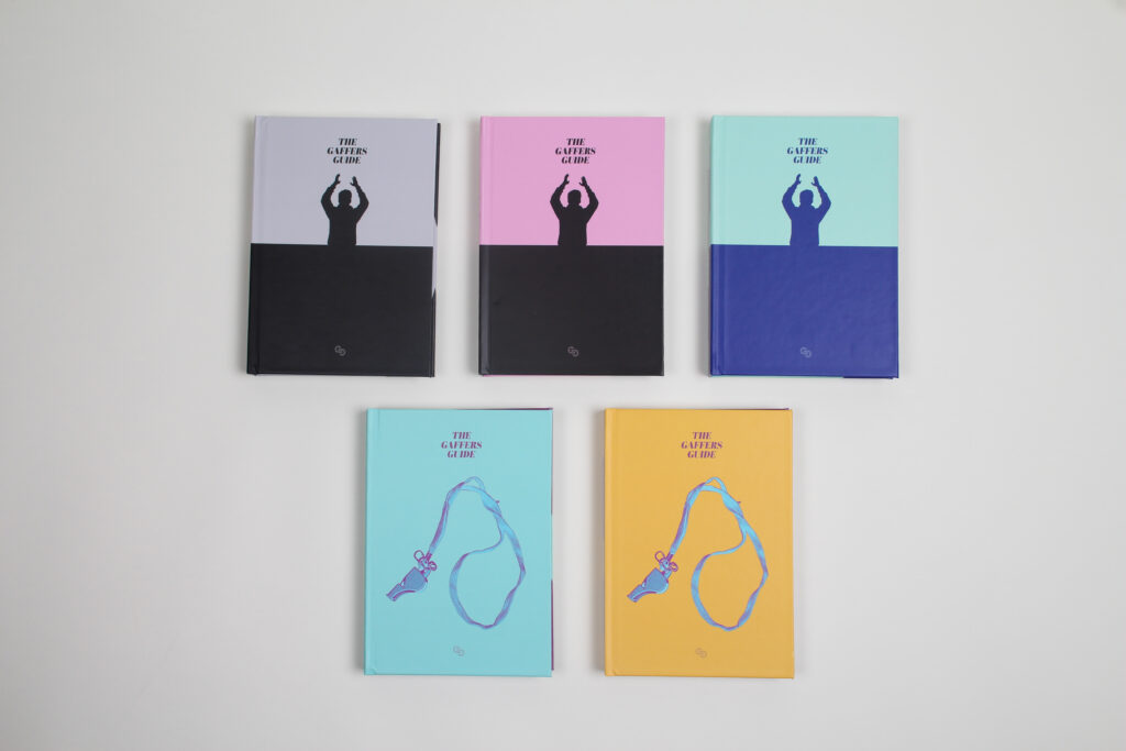
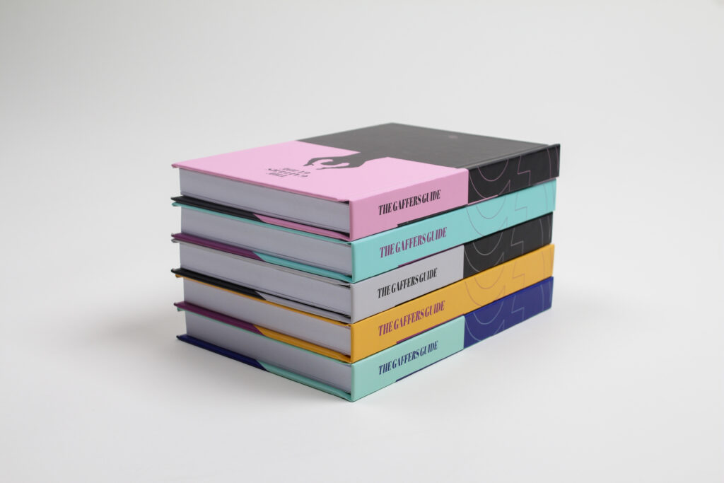
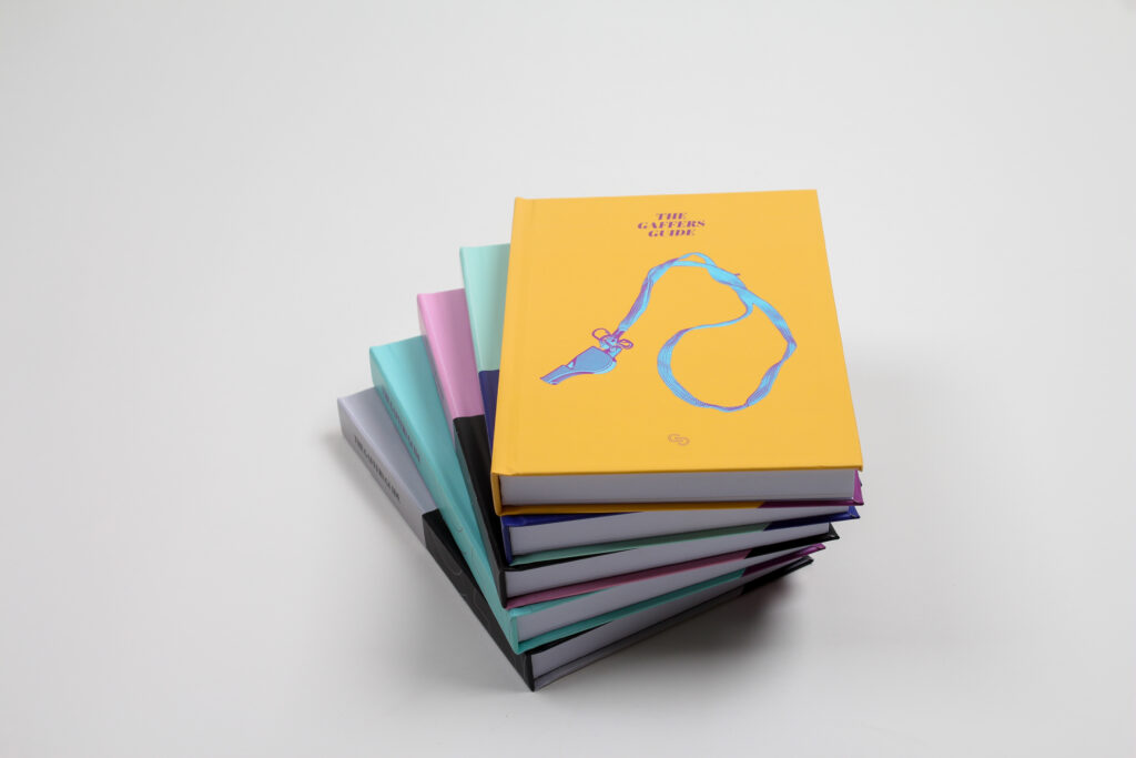
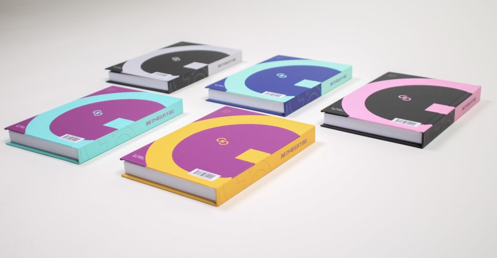
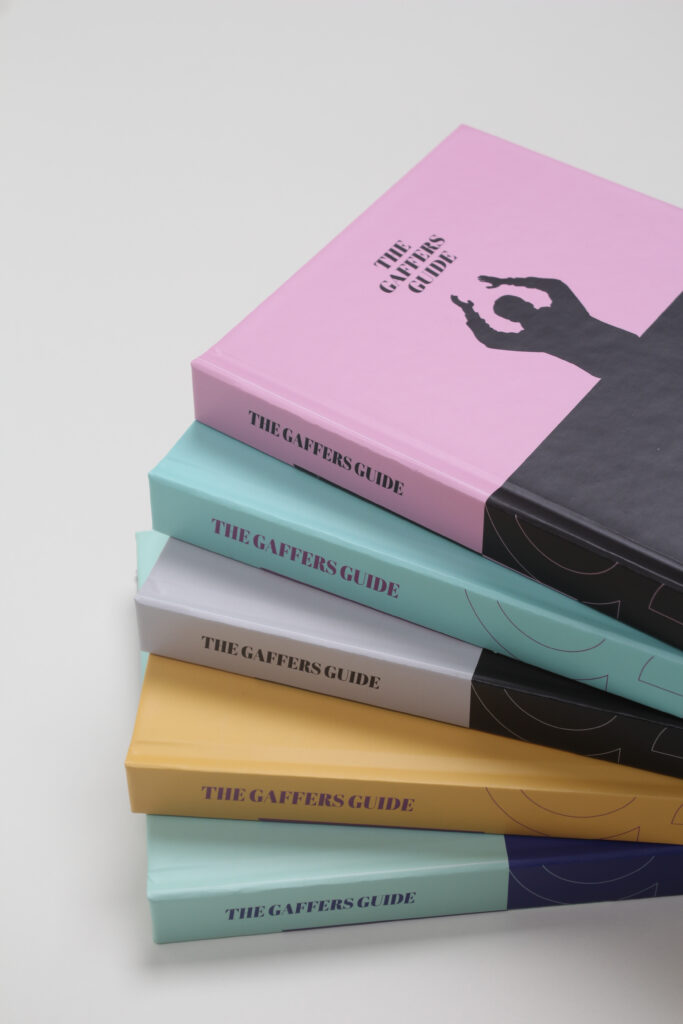
A complete publication design for The Gaffer’s Guide – a book project requiring a clear, structured layout and a consistent visual approach throughout.
The focus was on creating a design that supports readability, while presenting the content in a professional and engaging way.
Overview
The project required the design of a full publication, balancing a content with the need for clarity and consistency.
Without a considered layout system, publications like this can quickly become difficult to navigate and visually inconsistent.
The challenge was to create a structure that made the content easy to follow, while maintaining a strong and cohesive visual identity across every page.
The Challenge
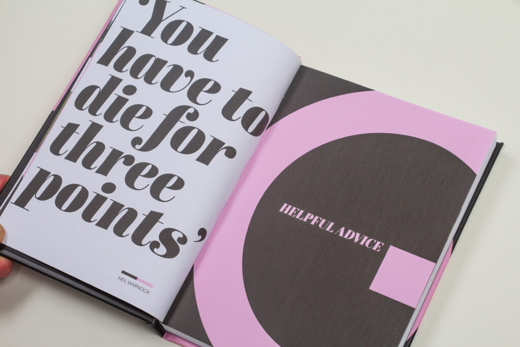
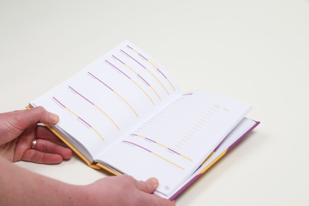
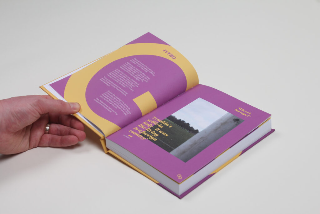
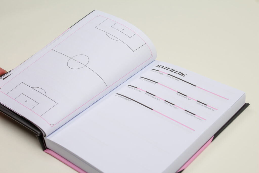
The project began by establishing a clear typographic hierarchy and grid system to organise the content effectively.
Careful attention was given to spacing, alignment and structure, ensuring each page felt balanced and easy to read.
The aim was to create a layout that guides the reader naturally through the content, without unnecessary distraction.
The Approach
The design focuses on clarity and consistency, using a stylised visual approach to keep the emphasis on the content.
Key elements included:
A structured grid system for consistency
Clear typographic hierarchy for readability
Consistent spacing and layout across all pages
Thoughtful use of visual elements to support, not overwhelm
The result is a publication that feels organised, professional and easy to navigate.
Design & Layout
The final design provides a cohesive and well-structured publication that presents the content clearly and effectively.
By focusing on design and consistency, the book is both functional and visually considered, creating a better experience for the reader.